Busica (Concept)
Information
Skill
- UI Design
- UX Design
Software
- Illustrator
- Adobe XD
- Sketch
Detail
- Client
- -
- Launch
- -
- Type
- App Design
- Charge
- Plannign, UI design, UX design, Icon design
About
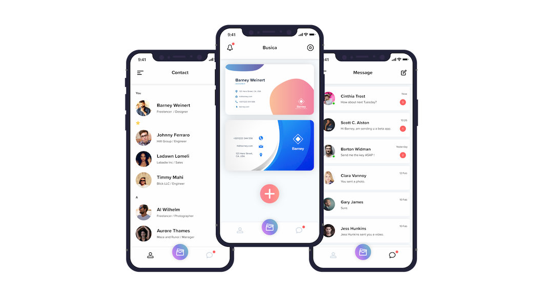
Based on business use, Busica was designed to realize a business card exchange application with the concept of business card management application + chat application. The current business card management application is to read an existing business card with a smartphone camera to create image data, and save the information described based on it as text data in the application. Moreover, data entry is human power! In the first place, business card designs are often made with software, and they are copied and used on paper hardware. Reading information from that hardware and saving it back as data in the software is awkwardly round, and it's not a smart way. In addition, I learned that there is a certain voice that I do not want to use the chat app for private use that I usually use at the job site. It is this Busica app that solves these complaints. Everything from the creation of the business card to the exchange is completed on the app. Furthermore, you can start chatting within the app as soon as you exchange business cards. Smarter than anything. By combining things that already exist and making things better, I have formed everyday questions.
Identity
I designed the iconic logo of the app that was aware of the brand identity so that I could know that I was a Busica at a glance. We also formulated color guidelines and typography guidelines to keep the app consistent and consistent.
Logo

Color Guideline

Typography Guideline

UX Design
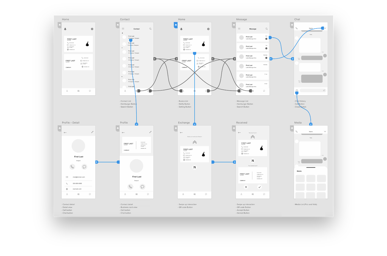
The most important thing in creating an app is UX (user experience). In order to make it easy for the user to use the app, we designed it with consideration of what function it is best to provide with which flow. In addition, while displaying the screen on an actual smartphone, it is designed in consideration of appropriate buttons, icons, and font size.
UI Design
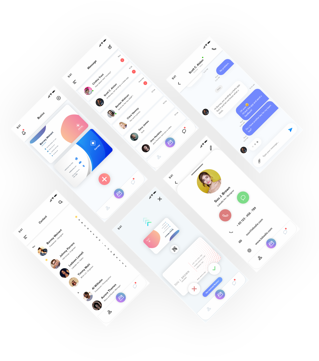
Busica's UI concept is simple, flat and soft. It is a soft UI that gives a gentle impression, as simple design as it does not degrade UX, flat color using the latest trend, and gentle impression. I wanted to open this app every day, I tried to be beautiful design.
Screen
Main
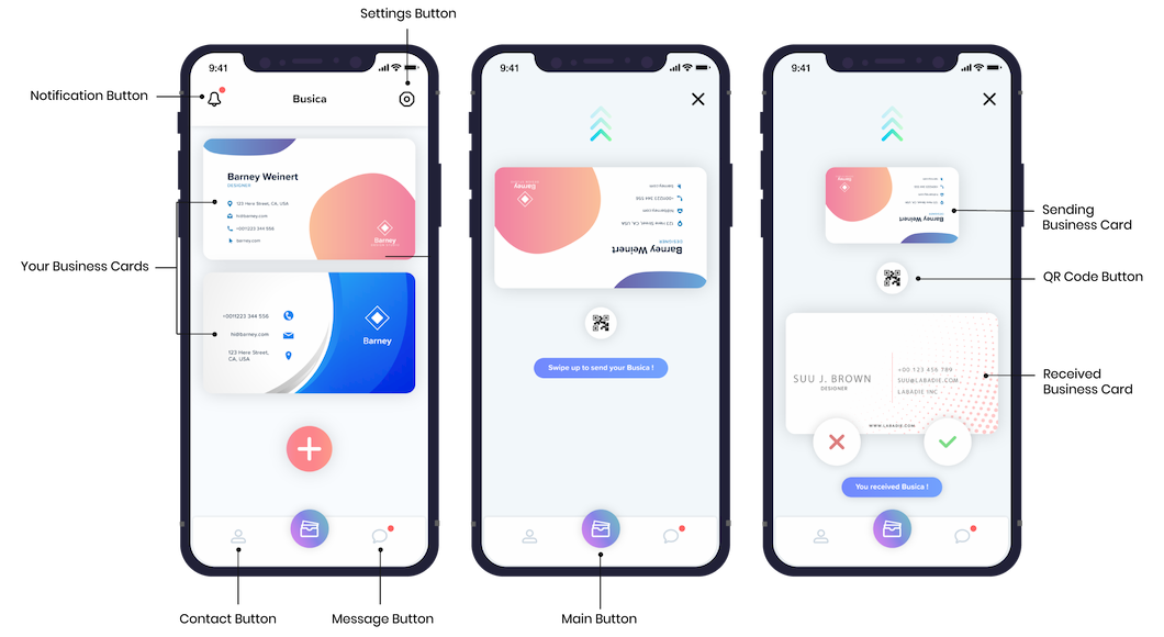
The main function of the main screen is managing and exchanging your own business card. You can select the card you want to pass face-to-face and swipe up on the screen to send. Multiple business cards are designed to be used depending on the job title and the situation.
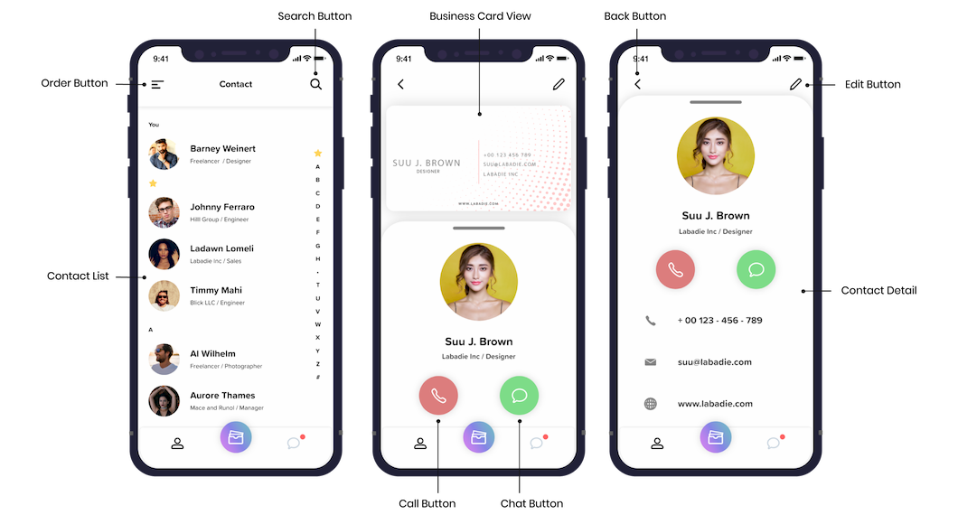
Contact
It is possible to manage all the business cards received here. You can browse with your business card by selecting from the list the contact you want to see. In addition to being able to immediately start phone calls and chats from the contact's profile screen, you can also scroll through the screen to view detailed information such as phone numbers, email addresses, websites and more.
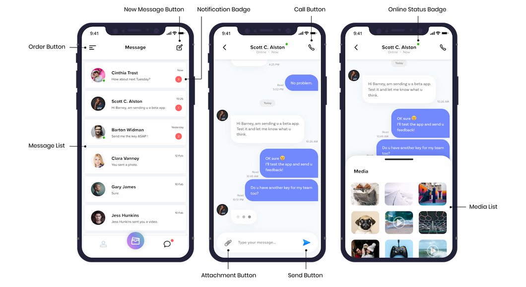
Message
We designed around the basic features that many chat apps have. By pressing the file attachment button, the card type file selection screen that appears from the bottom of the screen is personally a favorite. (3rd image)
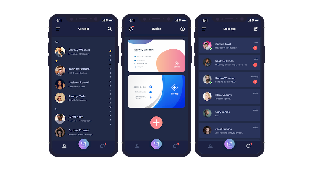
Dark Theme
It corresponds to the dark theme. If the background color is changed significantly, the impression of the application itself may be changed significantly, but I designed it with care not to give the user the difference of the impression with the light theme.
Icon
I think the icons are like a universal language. Even if the description of the icon is not written, I designed it so that I could understand instantly what it was showing. Flat and rounded to match the concept of Busica.
![]()